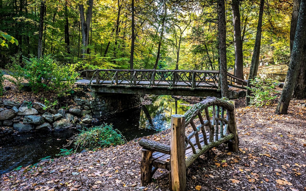
Choosing paint tones for your Hudson Valley home can be one of the most exciting parts of shaping your living environment. The region’s natural scenery, shifting seasons, and soft, atmospheric light create an ideal canvas for nuanced tones that feel intentional and deeply connected to the wondrous landscape around you.
When you understand how color works, you give yourself the ability to create spaces that truly reflect what you enjoy most in your surroundings. Whether you’re preparing your property for sale or simply refreshing the place you already love, the right paint choices can dramatically transform how each room feels from the moment you walk in.
You might be drawn to warm, cozy hues or bright, uplifting shades. You may prefer grounded earth tones that echo the region’s rolling hills or airy neutrals that let your furnishings shine. Whatever your style, color is far more than decoration; it acts as the foundation for the atmosphere you want to build. As you explore the possibilities, you’ll find that subtle differences in undertone, contrast, and saturation can make a tremendous difference.
The Hudson Valley’s shimmering light changes throughout the day, shifting dramatically with the weather and carrying a softness that artists have flocked to for centuries. When you take this into account, your approach to paint selection becomes even more tailored.
This guide will walk you through the science behind color, the techniques designers rely on, and the ways you can apply these ideas in your own Hudson Valley home.
Understanding Undertones and Why They Matter
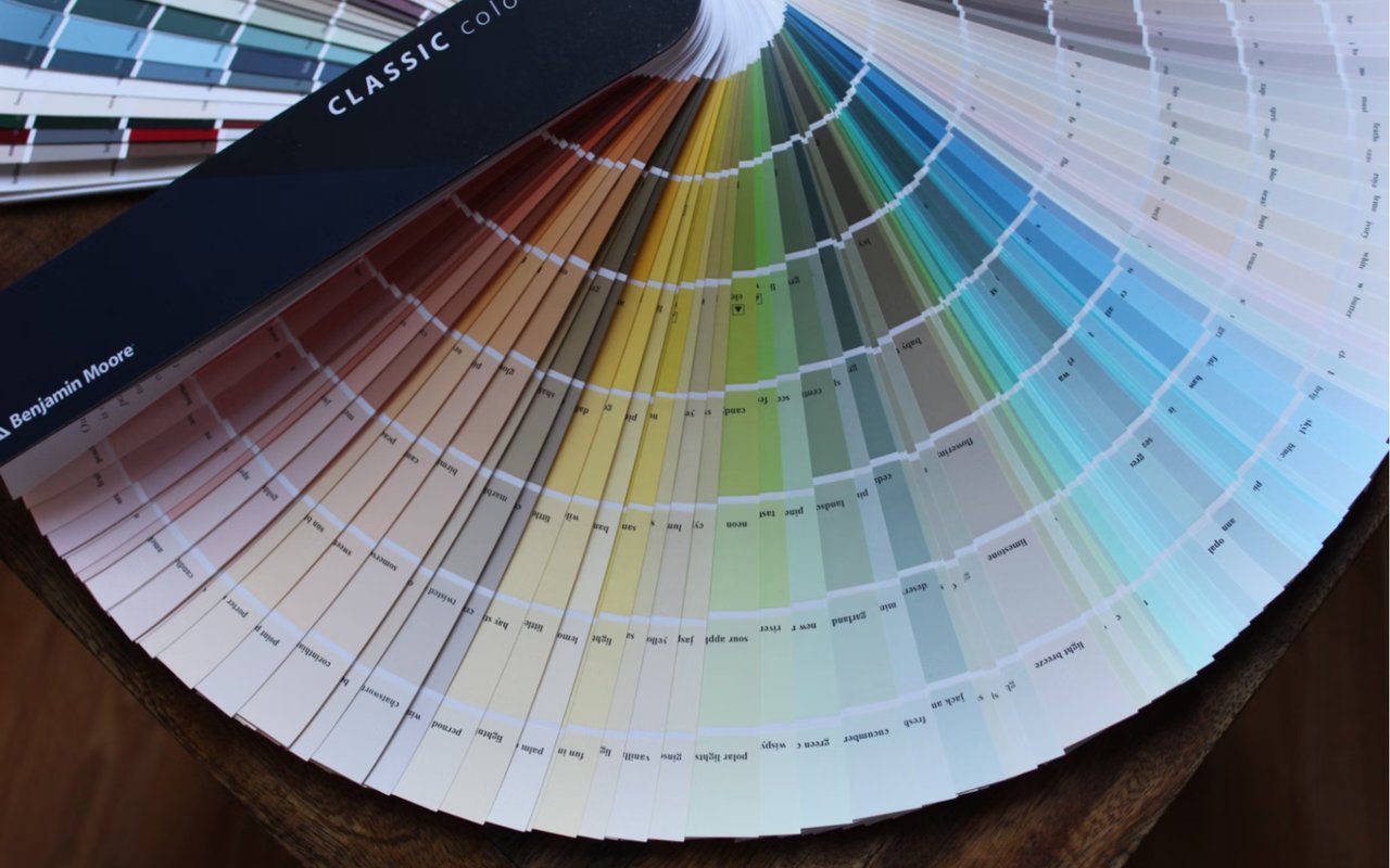
When you hold up a paint swatch, the color you see at first glance tells only part of the story. Every color carries an underlying cast; this subtle tint influences how the shade will look once applied to your walls. Even something that appears to be a pure neutral often carries a whisper of blue, green, yellow, or red. When you understand this, you begin to look at paint not as a flat shade but as a blend of components that each contribute to the final result.
Undertones are especially important when the natural light shifts. Morning light tends to be cooler, giving bluish or grayish undertones more prominence. Late-day sunlight tends to be warmer, causing soft gold or peach undertones to appear more noticeable. When your paint choices complement these lighting patterns, your rooms feel balanced and intentional throughout the day.
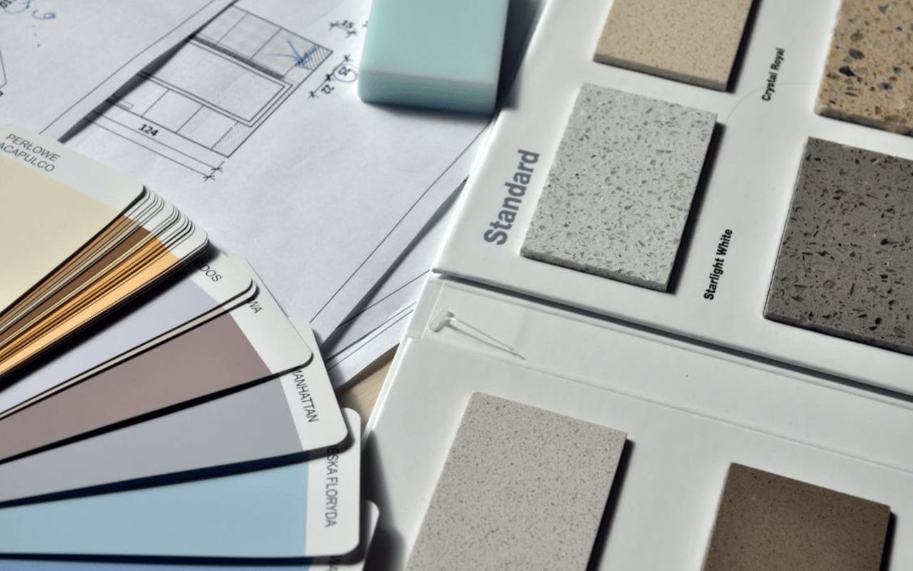
Comparing undertones side by side is one of the easiest ways to see these differences clearly. For example, two warm neutrals may look nearly identical until you place them next to each other. Suddenly, one appears more yellow and the other more beige or even slightly rosy.
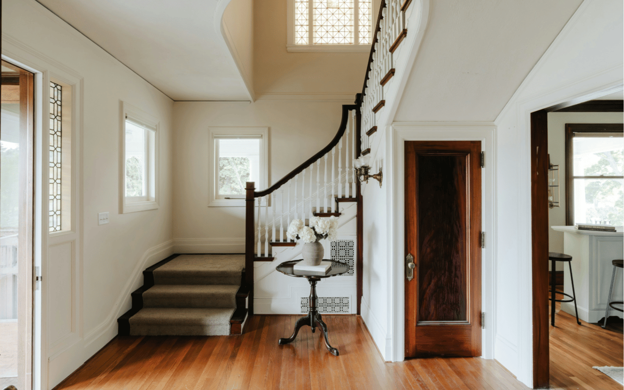
Considering the materials throughout your Hudson Valley home is crucial as well. Wood floors, stone countertops, and upholstery all carry their own subtle tones. When you coordinate undertones across these elements, your space feels cohesive even before you add decor or furnishings.
Undertones are especially important when the natural light shifts. Morning light tends to be cooler, giving bluish or grayish undertones more prominence. Late-day sunlight tends to be warmer, causing soft gold or peach undertones to appear more noticeable. When your paint choices complement these lighting patterns, your rooms feel balanced and intentional throughout the day.
Comparing undertones side by side is one of the easiest ways to see these differences clearly. For example, two warm neutrals may look nearly identical until you place them next to each other. Suddenly, one appears more yellow and the other more beige or even slightly rosy.
Considering the materials throughout your Hudson Valley home is crucial as well. Wood floors, stone countertops, and upholstery all carry their own subtle tones. When you coordinate undertones across these elements, your space feels cohesive even before you add decor or furnishings.
How Light Shapes Your Color Choices
Light transforms every paint color — sometimes subtly, sometimes dramatically. The Hudson Valley experiences bright summers, soft winters, vivid autumns, and lush springs, each bringing its own lighting qualities. Understanding these dynamics helps you choose colors that feel consistently appealing without losing their charm as seasons change..
North-facing rooms generally receive cooler, indirect illumination, while south-facing rooms are often bright and warm. East-facing rooms glow in the morning, and west-facing rooms gain deeper radiance in the evening. Each of these lighting patterns interacts with color differently.
A cool, pale gray may look serene in a south-facing room with warm daylight, but it may feel sharper or even bluish in a north-facing one. Earthy greens, soft taupes, and muted blues often perform well across all exposures in the Hudson Valley because they complement the region’s natural environment.
Artificial lighting also plays an important role. Warmer bulbs tend to enrich warm undertones and soften cooler shades, while cooler bulbs do the opposite. When you layer various light sources — overhead fixtures, floor lamps, sconces, and accent lighting — you create a more dynamic environment that influences how your paint looks.
Mood, Atmosphere, and the Psychology of Color
Color has the power to shape how a space feels, from uplifting and energetic to serene and restorative. When you choose paint with intention, you create rooms that support the experiences you want to have each day.
Warm tones — soft peaches, honeyed neutrals, and earthy golds — create a grounded, inviting atmosphere. They work particularly well in living rooms, bedrooms, and dining areas where you may want a sense of comfort or relaxation. These hues feel especially harmonious during autumn, when the region’s foliage glows with similar warmth. Cool tones, such as airy blues, muted greens, and gentle grays, bring a more refreshing, open feeling to your space. They’re excellent for areas where you want a sense of clarity or brightness, such as kitchens, home offices, or creative studios.
Strong contrasts add energy and dimension, whereas gentle gradients promote flow and continuity. No matter what effect you're aiming for, the key is aligning color with how you want your home to feel day after day.
How to Test Samples the Right Way
Testing paint samples is one of the most important steps in choosing the right tones, and doing this correctly can save you from frustration later. Many homeowners hold up a swatch and make a quick decision, but paint behaves differently once it’s on the wall. A thoughtful approach helps you make choices with confidence rather than guesswork.
Start by choosing several shades that appeal to you — both the tones you feel drawn to and the tones that seem like practical contenders. Paint generous swatches on multiple walls within the same room. This is especially helpful in rooms where light changes significantly throughout the day.
Pay attention to how each shade looks in the morning, afternoon, and evening. A color that feels warm and welcoming at sunrise may take on a richer or cooler quality as the day progresses. These shifts are natural; you simply want to make sure you love the color in every version of its appearance.
Testing samples also helps you visualize how the paint interacts with flooring, cabinetry, fabrics, and decor. The colors within these materials influence how your eye perceives the paint. When you observe your samples carefully, you begin to notice the subtle changes that reveal which color is the right choice for your home.
Incorporating Nature-Inspired Tones That Reflect the Region
One of the greatest advantages of living in the Hudson Valley is the abundance of natural beauty. From rolling hills and river views to blooming spring landscapes and vivid autumn leaves, the region provides endless inspiration for your paint palette.
Nature-inspired tones feel comforting and timeless, especially in areas where you want to echo the scenery surrounding your home. These colors also layer beautifully with different textures like wood, linen, metal, and stone.
Earthy greens are particularly effective because they mirror the region’s lush foliage. Whether you choose a soft sage or a deeper evergreen, these tones bring a grounded and serene feeling to your interiors.
Warm terracotta tones reflect the richness of autumn, while muted blues evoke the calmness of the Hudson River. Soft blush tones can bring a gentle warmth reminiscent of early morning light. By pulling inspiration from the landscape, you create a color story that feels naturally connected and visually appealing.
Begin Your Real Estate Journey
The Hudson Valley offers a unique environment where color transforms in remarkable ways, and embracing this allows you to choose shades that evolve beautifully throughout the day and across the seasons.
Whether you lean toward timeless neutrals, vibrant earthy tones, or bold, dramatic accents, your palette becomes a reflection of the rhythm and beauty that make the Hudson Valley such a special place to live.
If you’re searching for the perfect home in the Hudson Valley or striving for a seamless sale, TKG Real Estate will help you begin your real estate adventure.